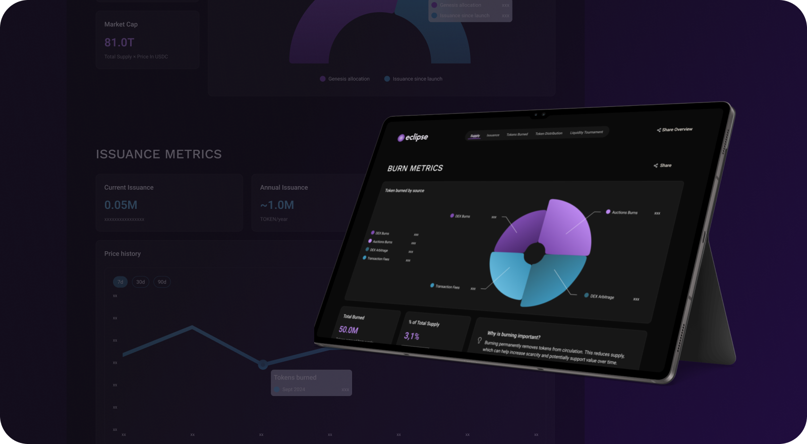
I designed a dashboard in collaboration with a developer and guided by a PRD provided by stakeholders. The work centered on organizing complex ecosystem information into a clear, structured interface.
* To avoid brand or legal conflicts, the product name and visual identity were adapted for portfolio purposes.
Project overview
The Challenge Make complex tokenomics data (supply, issuance, burn, distribution…) easy to understand through a clear, visual, and educational dashboard.
The Solution A modular analytics interface that organizes key metrics into intuitive sections, combining data visualization with contextual explanations to turn on-chain numbers into meaningful insights.
My contributions
I led the design process, including:
• Interpretation of the PRD and translation into UX requirements. • Collaboration with a developer and stakeholders to validate metrics and logic. • Competitive analysis and benchmarking of Web3 analytics tools. • Low-fidelity wireframes and layout exploration. • Component-based design prepared for developer handoff.
Making complex metrics understandable through visual systems and data design.
PRD analysis, Research, Hand off, Benchmark, Dev collaboration, Data validation, Dashboard layout, Modular design, Component-based
Discovery & Research
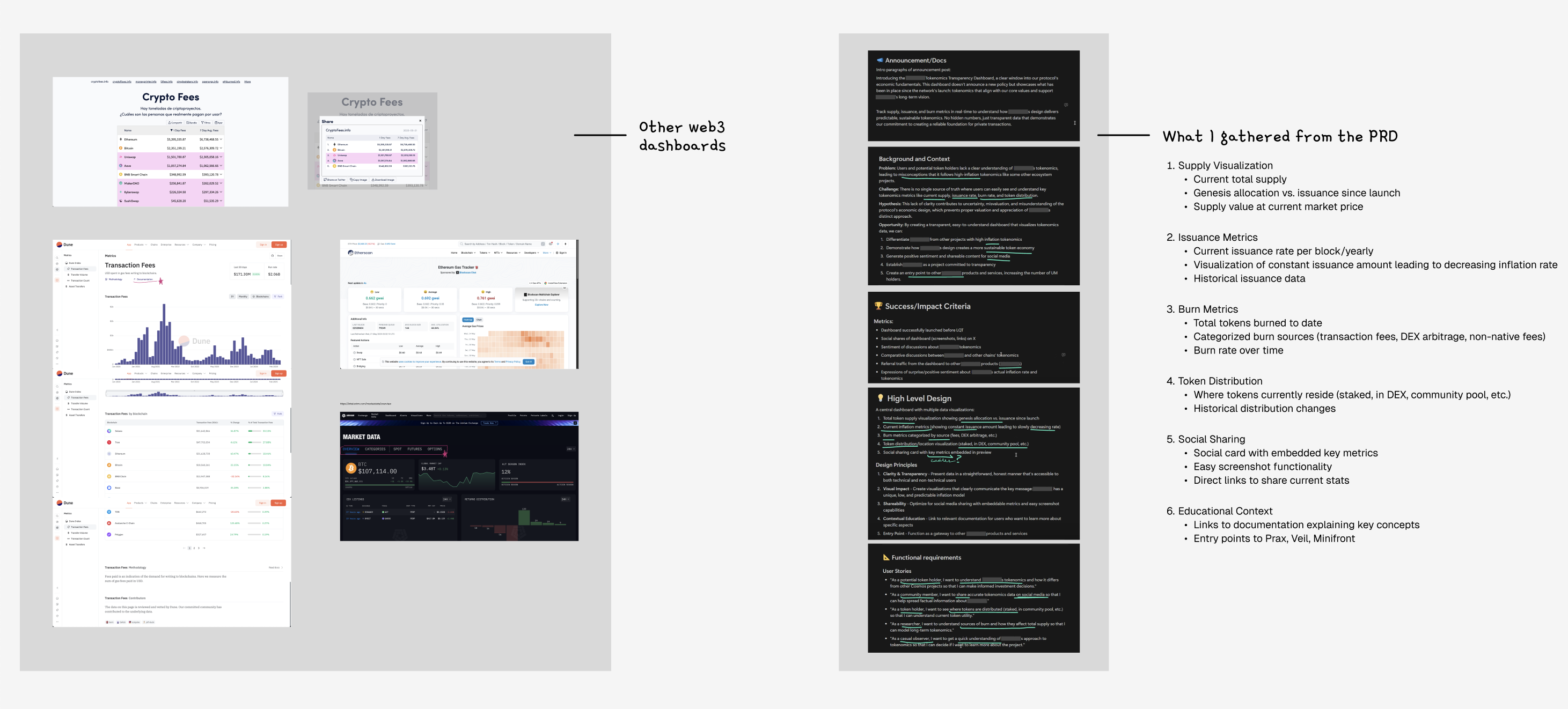
I started by reviewing the PRD and working closely with a blockchain developer to understand which metrics really matter, how they’re calculated on-chain and what users need to easily understand them.
In parallel, I benchmarked existing Web3 dashboards to spot usability gaps and opportunities to improve clarity through hierarchy and visual storytelling.
Users goal - Understand Eclipse tokenomics. - Share accurate data tokenomics on social media. - See where tokens are distributed to trust Eclipse.
Stakeholders goal - Clarity and transparency: Present data in a straightforward, honest manner that’s accessible to both technical and non-technical users. - Visual impact: Create visualizations that clearly communicate Eclipse model. - Shareability: Optimize for social media sharing to reach more people and strengthen the community. - Entry point: function as a gateway to showcase other Eclipse products and services.
Lofi Wireframes & First Explorations
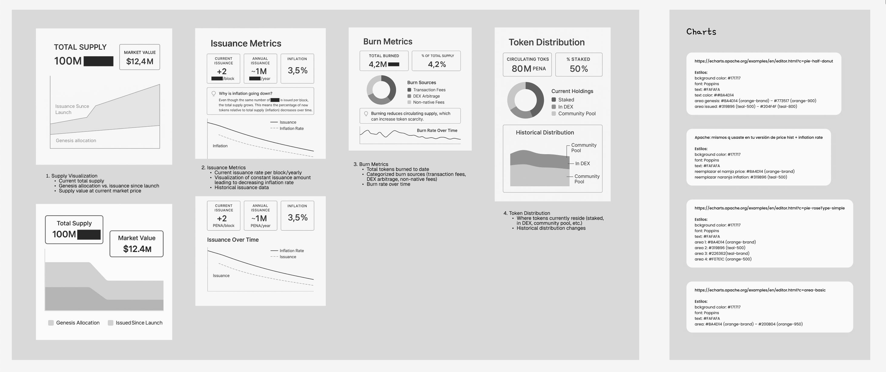
To quickly explore different ways of structuring the data, I started with low-fidelity wireframes and used AI (Chat GPT) to generate fast visual iterations. This allowed me to validate layout, hierarchy and grouping of metrics before investing time in detailed UI design.
At this stage, I also explored multiple chart types (lines, areas, donuts, stacked charts, candle-sticks). Part of the process was deciding which visualization best communicated each concept.
The focus was on:
Defining the main information blocks (Supply, Issuance, Burn, Distribution).
Testing how charts and explanations could coexist without overwhelming the user.
Evaluating different chart types to match each metric with the clearest visual representation.
Exploring multiple layout directions to compare readability and narrative flow.
From Structure to Building Blocks
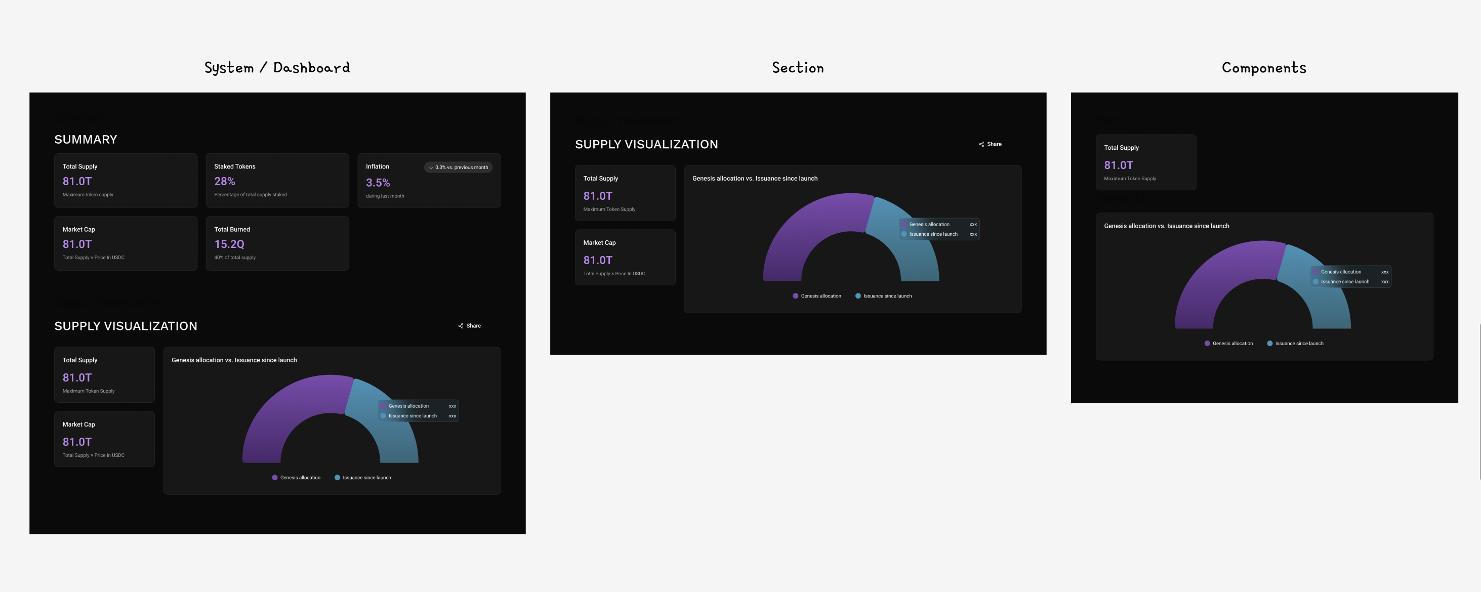
After defining the layout, I focused on breaking each section into smaller, reusable units. Instead of designing one static dashboard, I aimed for a system of components:
Metric cards
Chart containers
Legends and labels
Educational callouts
This made it easier to maintain visual consistency and prepare the design for development and future scalability.
Iterations & More Explorations
I went back and forth through multiple visual and structural iterations, testing different layouts, component arrangements and chart representations. Some metrics could be visualized in more than one way, so I explored multiple chart types to find the clearest representation for each use case.
Final Product
After validating structure, components, and data visualization choices, I consolidated everything into the final dashboard system.